|
很有创意的设计,用css3制作遨游浏览器的LOGO,具体方法如下: 首先我们来看一下实现方法:
最终效果图如下: 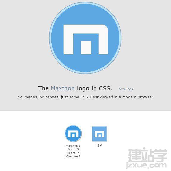 以上效果的全部代码如下:
<!DOCTYPE html>
(责任编辑:admin)<html> <head> <FCK:meta charset="utf-8" /> <FCK:meta name ="viewport" content="width=620" /> <title>Maxthon logo in CSS</title> <style> body{margin:0;background:#fff;font-family:"Lucida Grande",Verdana,Arial,sans-serif;font-size:75%;color:#333;text-shadow:0 1px 0 rgba(255,255,255,0.8);} #content{background:#e5e5e5;padding-bottom:2em;} #article{width:600px;margin:0 auto;padding:1em;text-align:center;} #article h1{font-size:1.6em;font-weight:normal;margin:0 0 0.5em 0;} #article p{margin:0;font-size:1em;line-height:1.5em;} #article a{text-decoration:none;color:#778899;} #results{padding:10px 0;border-top:1px solid #ccc;background:white;text-align:center;} @-webkit-keyframes spaceboots { 0% { -webkit-transform: translate(2px, 1px) rotate(0deg); } 10% { -webkit-transform: translate(-1px, -2px) rotate(-1deg); } 20% { -webkit-transform: translate(-3px, 0px) rotate(1deg); } 30% { -webkit-transform: translate(0px, 2px) rotate(0deg); } 40% { -webkit-transform: translate(1px, -1px) rotate(1deg); } 50% { -webkit-transform: translate(-1px, 2px) rotate(-1deg); } 60% { -webkit-transform: translate(-3px, 1px) rotate(0deg); } 70% { -webkit-transform: translate(2px, 1px) rotate(-1deg); } 80% { -webkit-transform: translate(-1px, -1px) rotate(1deg); } 90% { -webkit-transform: translate(2px, 2px) rotate(0deg); } 100% { -webkit-transform: translate(1px, -2px) rotate(-1deg); } } .howto:hover, .howto:focus { -webkit-animation-name: spaceboots; -webkit-animation-duration: 0.8s; -webkit-transform-origin:50% 50%; -webkit-animation-iteration-count: infinite; -webkit-animation-timing-function: linear; } .howto { font-size:12px; margin-left:20px;display:inline-block } /** Maxthon ********************/ #maxthon-logo { width: 250px; height: 280px; position: relative; margin: 0 auto; } #maxthon-logo div { position: absolute; } #maxthon-logo .border{ width: 240px; height: 240px; background:#b1e4ff; border:2px solid #789cb6; border-radius: 120px; -moz-border-radius: 120px; } #maxthon-logo .border{opacity:0.80;} #maxthon-logo .border:hover{opacity:1;box-shadow:0 0 15px #fff;-webkit-box-shadow:0 0 15px #fff;-moz-box-shadow:0 0 15px #fff;} #maxthon-logo .circle{ width: 230px; height: 230px; top:5px; left:5px; border-radius: 115px; -moz-border-radius: 115px; background:#3b99e3; } #maxthon-logo .m{ width: 150px; height: 100px; top:70px; left:42px; background:#ffffff; border-radius: 3px 20px 3px 3px; -moz-border-radius: 3px 20px 3px 3px; } #maxthon-logo .fix-m{ width: 35px; height: 45px; top:30px; left:33px; background:#ffffff; border:25px solid #3b99e3; border-bottom:none; } </style> </head> <body> <div id="content"> <div id="article"> <div id="maxthon-logo"> <div class="border"> <div class="circle"> <div class="m"> <div class="fix-m"></div> </div> </div> </div> </div> <h1>The <a href="http://www.maxthon.cn/" _fcksavedurl="http://www.maxthon.cn/" rel="nofollow">Maxthon</a> logo in CSS.<a href="http://ui<a href='http://www.cssk8.com/' _fcksavedurl='http://www.cssk8.com/'><u>css</u></a>.cn/<a href='http://www.cssk8.com/' _fcksavedurl='http://www.cssk8.com/'><u>css</u></a>3-logo/" _fcksavedurl="http://uicss.cn/css3-logo/" rel="bookmark" title="Permanent Link to ?css3д?logo" class="howto">how to?</a></h1> <p>No images, no canvas, just some CSS. Best viewed in a modern browser.</p> </div> </div> <div id="results"> <img src="http://uicss.cn/css3/comparison-white.png" _fcksavedurl="http://uicss.cn/css3/comparison-white.png" width="189" height="155" alt="Browser results"> </div> </body> </html> |