|
在前一篇文章:ASP.NET MVC 3 Beta初体验之超酷的Chart中介绍了Chart的使用,但是没有介绍到3D效果。这篇文章将介绍一下Chart的3D效果的展示。声明一点的是:这个Chart控件可能没有一些开源或者不开源,收费或者不收费的组件那般强大,我相信未来这个控件会越来越强大的。废话不多说了,看下如何展示Chart的3D效果。
显示3D的效果,微软给了我们两种解决方案。一种是使用他自带的样式,一种是自己配置一个显示样式的XML。
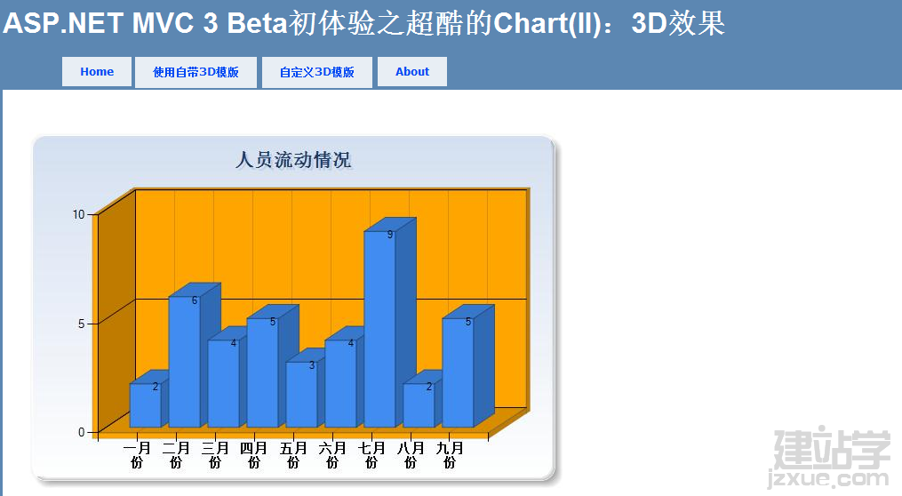
第一种使用自带的样式:很简单,在上一篇文章中其实有提到过,我们将模版改成ChartTheme.Vanilla3D。代码如下:
  代码 代码
<p>
@{
var key = new Chart(width: 600, height: 400,template: ChartTheme.Vanilla3D)
.AddTitle("人员流动情况")
.AddSeries(name: "Employee",xValue: new[] {  "一月份", "二月份", "三月份", "四月份", "五月份", "六月份", "七月份", "八月份", "九月份"},
yValues: new[] { "2", "6", "4", "5", "3","4","9","2","5"})
.Write();
}
</p>
效果:
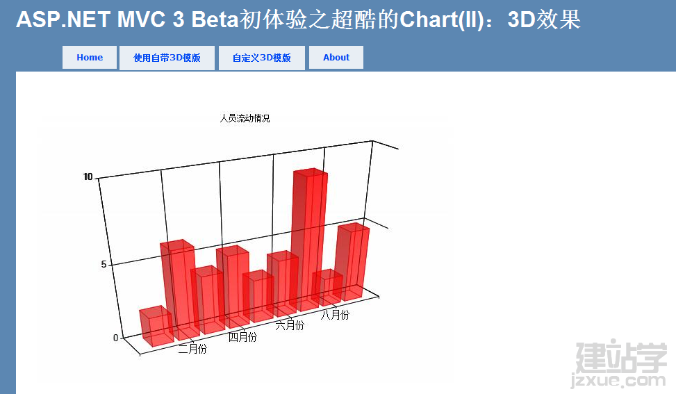
第二种方式:自定义显示样式。MVC可以让我们自定通过XML自定义Chart的显示样式。
定义一个XML样式:
代码
<Chart Palette="BrightPastel"
BackColor="#D3DFF0"
BackGradientStyle="TopBottom"
BackSecondaryColor="White"
BorderColor="26, 59, 105"
BorderWidth="2"
BorderlineDashStyle="Solid">
    <Series>
        <series _Template_="All"
       BorderColor="180, 26, 59, 105"
       CustomProperties="LabelStyle=Bottom"
       IsValueShownAsLabel="True">
        </series>
    </Series>
    <ChartAreas>
        <ChartArea _Template_="All"
       BackColor="Orange"
       BackGradientStyle="TopBottom"
       BackSecondaryColor="White"
       ShadowColor="Transparent"
       BorderColor="64, 64, 64, 64"
       BorderDashStyle="Solid">
            <Area3DStyle Enable3D="True" >
            </Area3DStyle>
            <AxisX ArrowStyle="Triangle"
           IsLabelAutoFit="False"
            LineColor="64, 64, 64, 64">
                <MajorGrid LineColor="64, 64, 64, 64" />
                <LabelStyle Font="Trebuchet MS, 10pt, style=Bold"
               IsStaggered="False" />
            </AxisX>
        </ChartArea>
    </ChartAreas>
    <Titles>
        <Title _Template_="All"
       Font="Trebuchet MS, 14.25pt, style=Bold"
       ForeColor="26, 59, 105"
       ShadowOffset="3"
       ShadowColor="32, 0, 0, 0">
        </Title>
    </Titles>
    <BorderSkin SkinStyle="Emboss" />
</Chart>
在创建Chart的代码修改一下:
代码
<p>
    @{
    var key = new Chart(width: 600, height: 400,templatePath: "~/_ChartFiles/OrangeBlue3DTemplate.xml")
    .AddTitle("人员流动情况")
    .AddSeries(name: "Employee",xValue: new[] {  "一月份", "二月份", "三月份", "四月份", "五月份", "六月份", "七月份", "八月份", "九月份"},
    yValues: new[] { "2", "6", "4", "5", "3","4","9","2","5"})
    .Write();
    }
</p>
效果:
通过这种方式,给了程序员很多的扩展空间。
(责任编辑:admin) |